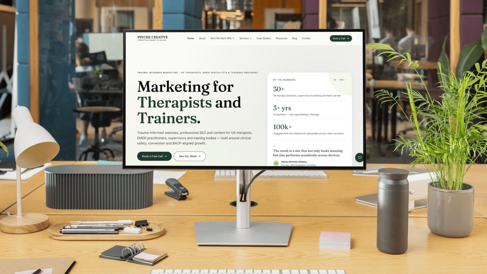
The best therapist website examples share a few patterns: a clear headline saying who you help and where, a calm palette, a real photo of the therapist, plain fees and one obvious next step such as booking a free call. Below are ten design patterns that suit different kinds of practice, and a page-by-page checklist for what each one needs.
What makes a good therapist website?
Before the patterns, the fundamentals. Whatever style you choose, a good counselling or psychotherapy website does five things within the first screen or two:
- —Says who you help, with what, and where. 'Counselling for anxiety and life transitions in Bristol and online' is better than 'Welcome to my practice'.
- —Shows a real person. A warm, natural photo of you does more for trust than any amount of design.
- —Feels calm. Plenty of space, a restrained palette, readable text, nothing flashing or popping up.
- —Makes the next step obvious and low-pressure: a free 15-minute call, a short contact form, or an online booking link.
- —Loads quickly on a phone. Most visitors arrive on mobile, often from a Google search or a directory profile.
Everything else is style. The ten patterns below are different ways of delivering those five things.
10 therapist website examples: design patterns that work
1. The quiet solo practice
A single practitioner, a handful of pages, a lot of white space. The homepage opens with a short, plain headline, a natural photo of the therapist and one button. Below that: who they work with, how they work, fees and a gentle invitation to get in touch.
Best for: counsellors and psychotherapists in private practice, especially those newly qualified or working part-time. Trade-off: with so little on the page, the copy has to be very good. Every sentence is doing a job.
2. The booking-first practice
Built around a single path to booking. A persistent 'Book a session' button sits in the header on every page, each service page ends with the same call to action, and the contact page is short. Navigation is pared back so there's nowhere to get lost.
This is the approach we took for Hutchins Psychology: a calm, refined identity with considered serif typography and a low-stimulus palette, and navigation rebuilt around one 'Book a session' path, designed mobile-first because most visitors arrive on a phone.
See how a booking-first structure works for an EMDR therapist and trainer. Read the Hutchins Psychology case study →
3. The local search specialist
Designed around the phrases people actually type into Google: 'EMDR therapy Manchester', 'couples counselling Leeds'. Each core page targets one clear search, with the town or city in the headline, page title and copy, and clinical terms translated into plain language.
We built Dr Lorna Robinson's site this way: four core pages mapped to search terms, a calm palette and clear credentials, with persistent contact calls to action. Best for: specialists in competitive towns and cities. Trade-off: it needs careful copy that reads naturally rather than stuffed with keywords.
See how a search-optimised EMDR website was planned page by page. Read the Dr Lorna Robinson case study →
4. The personal story
Leads with the practitioner's own voice and, where they're comfortable sharing it, their lived experience. Photography of the person and their surroundings carries the design. Credentials sit right alongside the story so each strengthens the other.
Gina Dallison's coaching site follows this pattern: a soft, natural design built around her photography and her message, with her lived experience and accreditation visible from the first screen, and pricing stated plainly. Best for: practitioners whose own journey is genuinely part of why clients choose them. Trade-off: it requires thoughtful boundaries about what you share, and that's a clinical decision before it's a design one.
5. The group practice directory
For practices with several clinicians. The homepage explains the practice as a whole, then a team page lets visitors filter or browse by specialism, modality, availability or location. Each clinician has their own profile page with a photo, a short bio and a direct way to enquire.
Best for: group practices and clinics. Trade-off: profiles go out of date quickly. Someone needs to own keeping availability and team changes current.
6. The psychology clinic
More structured and slightly more formal. Clear service pages for assessments, therapy types and conditions, HCPC registration and qualifications prominent, information for referrers and insurers on its own page. Colours lean towards softened navy or slate; typography is clean and confident.
Best for: clinical and counselling psychologists, multidisciplinary clinics, services that take referrals from GPs, solicitors or insurers. Trade-off: it can tip into feeling cold. Warm photography and plain-English copy stop it feeling institutional.
7. The trauma-informed, low-stimulus site
Everything designed to lower arousal: muted colours, no autoplay video, no pop-ups, gentle motion or none at all, a clear 'leave this site' option where appropriate, content warnings before difficult topics and a fast-loading page. Copy avoids graphic descriptions of trauma and focuses on what working together feels like.
Best for: trauma, EMDR, domestic abuse and sexual violence services. Trade-off: very few. Most of these choices improve any therapy site.
8. The content library
The therapist writes or records regularly, and the site is built around that: a blog, articles or videos organised by topic, with each piece linking back to the relevant service. The homepage features a few recent or popular pieces.
Best for: therapists who enjoy writing or video and want to build search traffic over time. Trade-off: it only works if you keep publishing. A blog with three posts from 2023 does more harm than no blog.
9. The training and CPD provider
Built around upcoming dates. Course pages show who the training is for, accreditation, dates, venue or online format, price and what's included, with booking or waitlist sign-up on the same page. Past cohorts, trainer bios and FAQs answer questions before they're asked.
Best for: EMDR trainers, supervision providers, CPD organisations. Trade-off: dates and availability have to be kept rigorously current.
10. The course platform
For practices selling online courses or resources. A catalogue organised around where the learner is, secure checkout, a learner area with progress tracking and certificates, and an experience designed for someone arriving anxious on a phone.
We rebuilt Fit 2 Practise this way, moving from WordPress to a custom-coded platform with Stripe checkout, a catalogue organised by stage of the NMC Fitness to Practise process and a learner portal. Trade-off: it's a bigger build and needs ongoing care.
See how a course platform was rebuilt around the learner journey. Read the Fit 2 Practise case study →
Which therapist website design pattern is right for you?
| If you are... | Start with pattern | Consider adding |
|---|---|---|
| A newly qualified counsellor | 1. Quiet solo practice | 3. Local search, once you've a few pages |
| A busy solo therapist with a waitlist | 2. Booking-first | Clear availability messaging |
| A specialist in a competitive city | 3. Local search specialist | 8. Content library |
| A practitioner with relevant lived experience | 4. Personal story | 7. Trauma-informed details |
| A group practice | 5. Group directory | 2. Booking-first |
| A psychologist taking referrals | 6. Psychology clinic | 3. Local search |
| A trauma or EMDR therapist | 7. Trauma-informed | 3. Local search |
| A trainer or CPD provider | 9. Training provider | 10. Course platform, if you sell online |
Most good sites combine two or three of these. A trauma-informed site can also be booking-first and built for local search. The patterns are starting points, not boxes.
What pages does a therapist website need?
Homepage
- —A plain headline: who you help, with what, where.
- —A warm photo of you, not a stock image.
- —One primary call to action, repeated lower down.
- —A short 'how I work' section and a summary of who you see.
- —Your professional body and registration (for example BACP, UKCP, HCPC), stated accurately.
About page
- —Written to the reader: what it's like to work with you, before your training history.
- —Qualifications, membership and registration, with membership numbers if you're comfortable.
- —A second photo, if you have one.
Your About page is often the most visited page after the homepage. We've written a full guide with example bios. Read: How to write a therapist bio →
Services or 'How I can help' pages
- —One page per main service, issue or modality, if you want them to appear in search.
- —What it is in plain English, who it's for, what sessions are like, and how to start.
- —No promises of outcomes, cures or timescales.
Fees and practical information
- —Session length and price, concessions if you offer them, cancellation policy.
- —Location, accessibility of the room, parking and public transport, or how online sessions work.
- —Availability, stated honestly, including if you have a waitlist.
Contact page
- —A short form asking only what you need: name, contact details, preferred way to be contacted, and an optional brief message.
- —A note that you can't offer crisis support, with signposting to NHS 111, Samaritans (116 123) and 999 in an emergency.
- —How quickly you usually reply.
Privacy notice and legal
- —A UK GDPR privacy notice that accurately describes what your form collects and where it goes.
- —A cookie notice and consent banner if you use analytics or other non-essential cookies.
What should you avoid on a therapy website?
- —Stock photos of people in visible distress: head in hands, crying, sitting alone in the dark.
- —Pop-ups asking for an email address before someone has read a word.
- —Countdown timers, 'only two spaces left' banners or any other scarcity language.
- —Client testimonials that breach your professional body's guidance.
- —Walls of clinical jargon. 'Integrative, relational, person-centred approach' means little to most clients without explanation.
- —Autoplay video or music.
The examples people send us as inspiration rarely have the cleverest design. They have the clearest first sentence and the kindest photo. That's the bit worth copying.
Adam Watters, Founder, Psyche Creative
If you'd like a site built around the pattern that suits your practice, we design calm, booking-first websites for therapists across the UK. See our therapist web design service →
Frequently asked questions
What should be on a therapist's website?
At minimum: a homepage that says who you help and where, an About page, service pages, fees and practical details, a contact page with crisis signposting, and a UK GDPR privacy notice. A real photo of you matters more than any design detail.
How many pages does a therapist website need?
Five or six is enough for most solo practices: home, about, services or how I can help, fees, contact and privacy. Add individual service pages if you want to rank for specific searches.
Should I put my fees on my therapy website?
In most cases, yes. Clear fees reduce anxiety for prospective clients, filter enquiries and save time on both sides. You can also mention concessions or sliding-scale places if you offer them.
Can I use client testimonials on my therapist website?
Be very cautious. Asking clients for testimonials raises real concerns about the power dynamic and confidentiality, and professional bodies urge care. Check your own body's current guidance, such as BACP's, UKCP's or HCPC's, before using any.
Where can I find good therapist website examples?
Directories and search results will show you plenty, but focus on patterns rather than copying a specific site. Look at how clearly each one states who it helps, how calm it feels and how easy the next step is.
Adam works with UK therapy practices, EMDR trainers and mental health organisations on websites, social media and digital campaigns. He started Psyche Creative to give clinicians a marketing partner who understands the sector — and won't compromise on professional standards to get results.